Guide to color theory for artist

If you are an artist, you will know that choosing the right colors for your painting is difficult in the art industry. Your color choice will make or break your design in just a few seconds; therefore, you should know all about the color theory and its basics before choosing the color you should know. Colors are an essential part of your painting or drawing. It will bring soul to your picture.
Following is the guide color theory for the artist, giving you detailed information about the color schemes. It will also help you to choose the appropriate color schemes for your painting.

Basics of color theory –
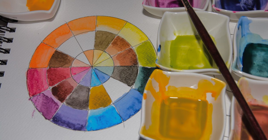
A primary color pallet for painting is one of the great things you should know when starting to draw. Primary colors and the color wheel will help you to choose the appropriate color for your drawings. You should know that the color wheel is formed by the primary, secondary and tertiary colors. The secondary colors will develop when you combine primary colors, and the tertiary colors are the combination of the primary and secondary colors.
The color wheel will tell you how all these colors are related to each other. You can’t obtain primary colors by combining any different colors. Many of the artists use only primary colors for their paintings. They modify their colors by mixing the others.

Color combinations –
The color theory also includes the ways to color combinations in your painting. There are mainly two types of using color schemes that are contrast and harmony. When you see the color wheel, you will get which color will most contrast if used together. If you used the color next to each other, it would create the minimum contrast known as analogous colors.
You have to choose suitable color schemes for making a significant impact on the audience. If you choose the colors at the opposite ends of each other, they will bring more contrast than the other. These color schemes are known as complementary color schemes. You should know that the complementary color painting will bring life to the image.
The third and vital color scheme that you should know is triadic. In this color scheme, you have to use the colors from the color wheel, which are evenly spaced from each other. This will create equal harmony and contrast in the painting.

 There are two things that I'm passionate about: Drawing + Art. As an art teacher, author, graphic designer, and mom to 3 creative thinkers, I get to explore my passions every day! Learn more...